4 Billboards That Prove How Creative Advertising Can Be
Nothing boils my blood more than a boring ad. After working in a creative agency, I have come to both admire advertisements for their creativity and beauty while also learning to loath others for their boring, overdone and distasteful font choices, mostly thanks to Derek. And trust me, this isn’t a rant by an inexperienced millennial about how advertising needs to be more creative. There are plenty of advertising campaigns that deserve to be applauded, but why are they far and few between? We’re in 2013, people. There is no excuse for an “okay” ad anymore. And do you know what? A lot of people are paying for just “okay” advertising.
Today, companies are steering clear of outbound advertising and focusing more on their online reach. It’s true. Without a website and some social media buzz you probably don’t exist in the eyes of my generation, or the generations to come. But that Facebook post you are spending hours sweating over only has a lifetime of about 3 hours (and you thought fruit flies had it bad?). Not to mention that 140-character limit to twitter really stings when you want to make a big impact. We are becoming numb to the digital advertising techniques because, let’s be honest, the majority of it just isn’t interesting enough. It rarely slaps you in the face hard enough to divert your attention away from what you were doing the second before, and so it gets lost and forgotten in the snap of a finger.
This isn’t new news. Think of all of the billboards you pass while driving; how many of those do you actually remember? Most likely the answer is somewhere between none and not many, although you probably would if you passed these ones. Here are examples of billboards that thought outside of the box to create real, impactful moments to connect with their customers and would make you stop driving to pay attention. And that’s what it really is all about.
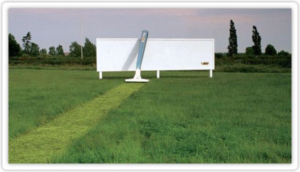
BIC razors shaved their way through this field to make quite the statement against a stark white background.
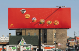
McDonalds created a sundial to let their customers know that they’ve got something for you at all hours of the day.
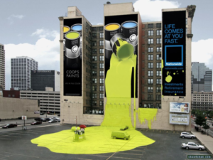
Nationwide Insurance did this paint spill to be a part of their Life Comes At You Fast campaign.
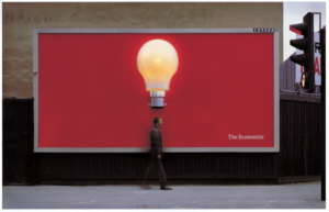
The Economist plays on human interaction with this billboard, which holds a lightbulb that only lights up when a person passes under it.
The point is, with the right creative team, everything from a billboard to a facebook post can be awesome and memorable as long as you do it right.


Sorry, the comment form is closed at this time.