Whipp’s Top 5 College and University Website Designs
1: Wofford. Ok, we may be slightly biased…We did design this one. But it speaks for itself. It is a beautiful site, easy to navigate and easy on the eyes. It’s an all around goody bag of worthy design technique to model after:

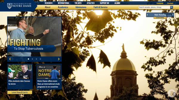
2: University of Notre Dame. We like ND’s use of school color and moving menu bar. See for yourself:

3: Vanderbilt University. Can you say unyielding? Great pictures, overall great design:

4: Boston University. Maybe it could be a bit bolder, but we like that it’s sleek:

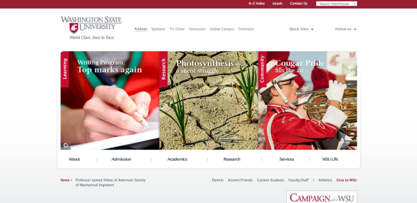
5: Washington State University. We like this one because it is simple and clean. It’s pleasing to look at, but not overwhelming to navigate:


Sorry, the comment form is closed at this time.