
Taking Wofford Travel Brochures Out of This World
The transition from High School to College is one of life’s great mile-markers, so it’s no surprise that the decision to select your future Alma mater is one of careful deliberation and consideration. That’s why when Wofford came to us to design their travel brochures; we decided to take their future students out of this world.
For those of you who aren’t keeping up with admissions lingo, a travel brochure is essentially a small sample of a viewbook, conveniently sized for counselors to carry around while on the road. This handout gives prospective students a small glimpse into the school’s lifestyle while leaving them with a physical reminder to explore further. The tricky part is making it interesting.
Wofford breeds bright, sophisticated and determined students, but they still have character, too. To match Wofford’s authentic identity, we knew the brochure would have to be nontraditional. We also knew that Wofford’s website is the key; a place where everything a prospective student would go looking for could be found. So while Wofford is encouraging student’s to reach for the stars, we wanted their future students to have the universe at their fingertips.
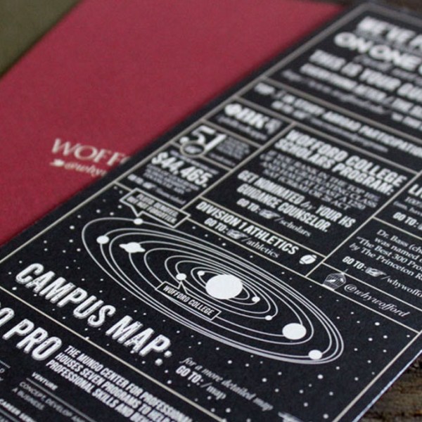
We kept it simple and elegant, trying to parallel a gift, not just a handout. The card envelope is thick cardstock in a rich shade of deep olive green with an elegant title. The card inside is a deep red with matching Wofford logo, clean yet memorable. When you flip the card over, you see a list of facts arranged in an interesting yet easy to read fashion, inspired by the 1800’s but with a modern twist. While a piece of 20 or 32 pound paper warrants itself to be tossed out without a second glance, this colorful card feels more like an invitation than a brochure.
But we didn’t just want it to look good either. While most travel brochures are crammed with facts and figures, we took just a handful or two of Wofford’s interesting topics and left them that way: interesting. No elaboration, essay explanations or letters from the president, just simple and clear facts to spark interest and directions on how to find out more. Wofford believes that humor should be a part of admissions marketing and our job is not to change that identity, but to elaborate on it. A normal campus map? We say no! From text reading “94% of students live on campus. 100% wish they did (um, have you seen The Village?)” to a galaxy campus map where Earth is labeled “Wofford College” this travel card is both captivating and informative. (Besides, what is a prospective student going to do with a real campus map if you are handing them out while on the road?)
The end result? Success.
Sorry, the comment form is closed at this time.