
Stories Behind Some of the Most Well Known Logos
From Microsoft to McDonalds, every company has a brand image to uphold. Making sure the corporate identity matches the company’s mission is not only done with actions but with art. A company’s logo and brand image can say a lot about what the company wants to portray to its audience, but sometimes the stories behind how the logos came to be are better than the logos themselves.
Nike’s Swoosh
In 1971, after an accidental meeting at Portland State University, Carolyn Davidson presented a group of sketches to Phil Knight, Jeff Johnson and Bob Woodell. In the group of sketches was the now globally known and infamous “swoosh,” a symbol of Nike’s power and brand image that can be recognized from all corners of the world by everyone from the hyper-rich and famous to the neighborhood basketball pickup game athletes. But in 1971 that check-mark design only stood for the hopes and aspirations of a concept product for Blue Ribbon Sports, a West Coast distributor for Tiger shoes at the time. Davidson was working a freelance graphic design job for $2 an hour at the time, and got a $35 check for the design. Today, Nike and its subsidiaries record roughly $20 billion in sales per year. That’s $35.00 to $20,000,000,000.00 in case you wanted to see it written out.
Microsoft’s Bilbbet
From the early attempts in the 70’s resembling disco to the “blibbet” design (may or may not have been named after a burger served in the office’s cafeteria) and beyond, Microsoft has gone through years of changing looking logos. The start of their longest lasting and most well known, however, was formed in 1987, dubbed the pac-man logo, which featured a black italic name. This was modified over the years with different slogans and slight graphic changes but it wasn’t until 2012 that the company switched over to the 4-color tile graphic, similar to the Windows logo, and grey type look. I’m not saying I don’t like it. I just think I would like it more if it was still referring to their cafeteria hamburger.
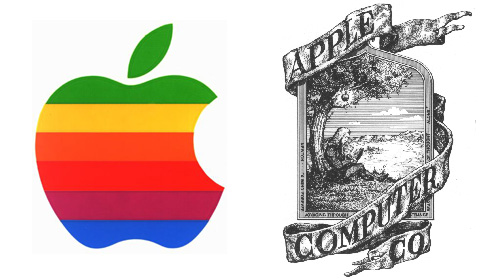
Apple’s Apple
With its fair share of controversy and rumors over the years, Apple also stirs up quite a few faux tales when it comes to their logo. As an ode to Sir Isaac Newton, the first logo designed by Ronald Wayne was an image of Newton himself sitting under a tree with the gravity-defying fruit hanging from above. Minimalist Jobs obviously didn’t care for that much, and soon the logo was made a rainbow striped apple silhouette, the colors meant to resemble the color advances and abilities the apple computers were comprised of. But the fun part of the logo’s history begins with the apple’s bite, which has been said to be a reference to Adam and Eve’s seduction in Eden Gardens. Or was it a tribute to Alan Turning, a world-renowned mathematician who committed suicide via cyanide-laced apple? Neither actually. In an interview with BBC, Jobs denied the theory. I guess the byte in the fruit will continue to spark controversy and tales of its origin.
McDonalds’s Golden Arches
When McDonalds opened in 1940 it was actually called “McDonald’s Famous Barbecue.” The company found out it had a better handle on burgers it changed its name to “McDonalds Famous Hamburgers” in 1948. The “golden arches” as they are now commonly known didn’t appear until the early 60’s as a reference to the company’s exterior architecture designed by Stanley Meston, with a sloped roofline and two large yellow arches on either side. Who would have thought the logo would have been inspired by the building?
Yahoo!’s Jumping Man Before Yahoo! was Yahoo! it was “David and Jerry’s Guide to the World Wide Web,” named after its founders Jerry yang and David Filo. The name Yahoo! wasn’t changed until 1994, and is an acronym for Yet Another Hierarchical Officious Oracle, even though Filo and Yang insist they selected the name for it’s slang definition meaning “rude, unsophisticated, uncouth” (Sure, guys. We will believe that you picked the name for the badassery meaning derived from Gulliver’s Travels references and not the acronym words that define your database. Who are you trying to fool?) The original Yahoo! logo was the “Yahoo! Jumping Y Guy” before it was Y! and Yahoo!
Google’s Coloring I bet you never stopped to think about why Google’s logo has a green “l” have you? Funny, me neither, but now I’m curious. Ruth Kedar, the logo’s graphic designer, said they picked “primary colors, but instead of having them pattern go in order, we put a secondary color on the L” so that everyone knows that “Google doesn’t follow the rules.” You go Google! Wait, but don’t put that exclamation point back on there, we know you only did that to mock Yahoo!…
Sorry, the comment form is closed at this time.